Designite

Designite

Designite featuring great design, architecture, fashion, graphics and innovation from across the globe.


Archadia

Archadia is a brand identity created for a higher education school of architecture based in Venice, Italy. The symbol is a stylized letter A, split into two solid volumes to suggest both stability and movement. The letter A stands for the brand name and also for academy, architecture and abitare, the Italian word for living. The form is built from an equilateral triangle inscribed in an isosceles triangle. The blue color reflects the institutional role of the school and the water of the Venice lagoon. The vector logo works on light and dark backgrounds.

Continue reading
 

SP Saffron Grotesk

Saffron is an elegant contemporary neo-grotesque sans-serif typeface with strong stylistic geometric contrasts, drawing on the aesthetics and the typographic standards of Swiss modernism. The distinctive wide-open stance was designed to give the right visual consistency for branding and communications. This authentic and original typeface represents a shifting contemporary aesthetics. The specimen is divided into sections, with ring binder posters inside the pack.

Continue reading


Type Specimen Alskar

Alskar sans is an elegant contemporary wide sans serif typeface with strong stylistic geometric authentic contrasts, drawing on the aesthetics and representing the shifting contemporary aesthetics. The type specimen was printed as a newspaper A2 (folded and sent as A4) and presents the typeface with a modern feel and experience.

Continue reading


Wind Art Museum

Wind Art Museum is a logo created for an art space in Xi'an that combines on-site creation, art exhibitions and aesthetic education. The mark is built from the Chinese character for beauty, which serves as the main memory graphic. Varying line thickness makes the character appear to be blown by the wind, linking the form directly to the name of the museum. The design was produced with computer graphics. The intent is a simple and distinctive symbol that expresses the character of the museum and remains easy to recognise and recall.

Continue reading


Gung Ho

Gung Ho is a cover illustration created for the French deluxe edition of the comic series Gung Ho. The artwork avoids the drawn black outline used in most comics and applies a cut-out collage approach that keeps the image clear. Silhouettes are treated with colour to create an expressionistic impression that supports the tone of the story. The story is set in a post-apocalyptic southern Europe where survival depends on fortified settlements. The image captures a moment of danger, youthful courage and released teenage adrenaline. The digital artwork was made with a graphics tablet.

Continue reading


Tsubasa.Y

Tsubasa.Y is a vintage selection shop, that in the piles of clothing of different times, looking for the exclusive taste of different self, constantly experimenting and merging, producing a fashion sound that this generation has never had before, just like the name of Tsubasa (wing), leading the ancient fascination to fly in the different clothes between the texture and the story. This case packs the shop's identification, packaging, and print design.

Continue reading


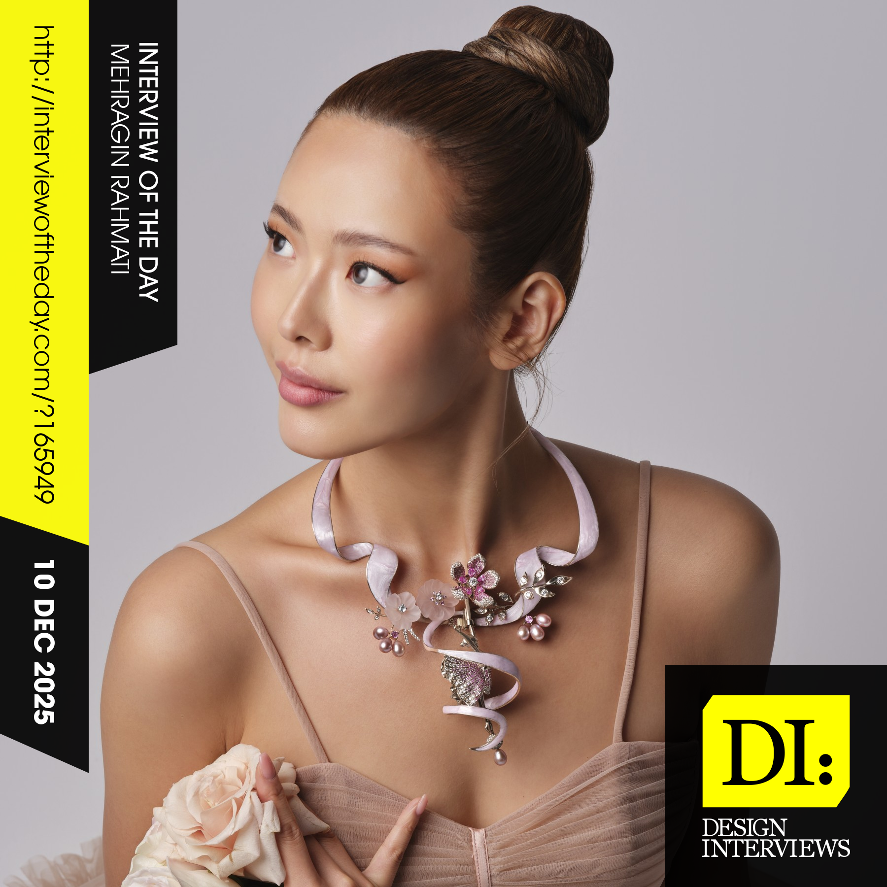
Design interview of the day

Read the latest interviews and conversations on design, creativity and innovation between design journalist and world-famous designers, artists and architects. See latest design projects and award-winning designs by famous designers, artists, architects and innovators. Discover new insights on creativity, innovation, arts, design and architecture. Learn about design processes of great designers.

Continue reading
